Teach Away · Teacher Experience · 2020
Turning a job board into a teacher's home base
Due to confidentiality, I am unable to publicly display my work.
Teach Away · Teacher Experience · 2020
Turning a job board into a teacher's home base
Teach Away's teacher dashboard was mostly a list of featured jobs, with one row for applications. Teachers used it as a doorway to the job board, and the courses that earned the company revenue got less than 4% of the traffic leaving it. I redesigned it around what teachers come back to check. In the three months after launch, course sales rose 16%, dashboard engagement rose 7%, and job applications per teacher rose 3.2%.

- +16%
- course sales
- +7%
- dashboard engagement
- +3.2%
- job applications per teacher
- 43%
- of dashboard exits went to the job board before the redesign
- My role
- Product Designer: research, data analysis, interaction and visual design
- Team
- Product Manager · Marketing
- Timeline
- 2020 · Shipped
- Tools
- Google Analytics · Hotjar · Sketch
01 · CONTEXT
One page, three audiences
Teach Away connects teachers with schools around the world. Teachers search and apply for jobs, schools search for teachers, and Teach Away sells the courses and certifications that make teachers more hireable, like TEFL and its Teacher Certification Program.
The dashboard is where a signed-in teacher lands. By 2020 it had to serve all three groups: teachers tracking their job search, marketing selling courses, and schools looking for available teachers. In practice it served none of them well.
HOW MIGHT WE
Improve the teacher dashboard so it gives teachers real value, and drives additional revenue for Teach Away?
02 · THE PROBLEM
A job board posing as a dashboard
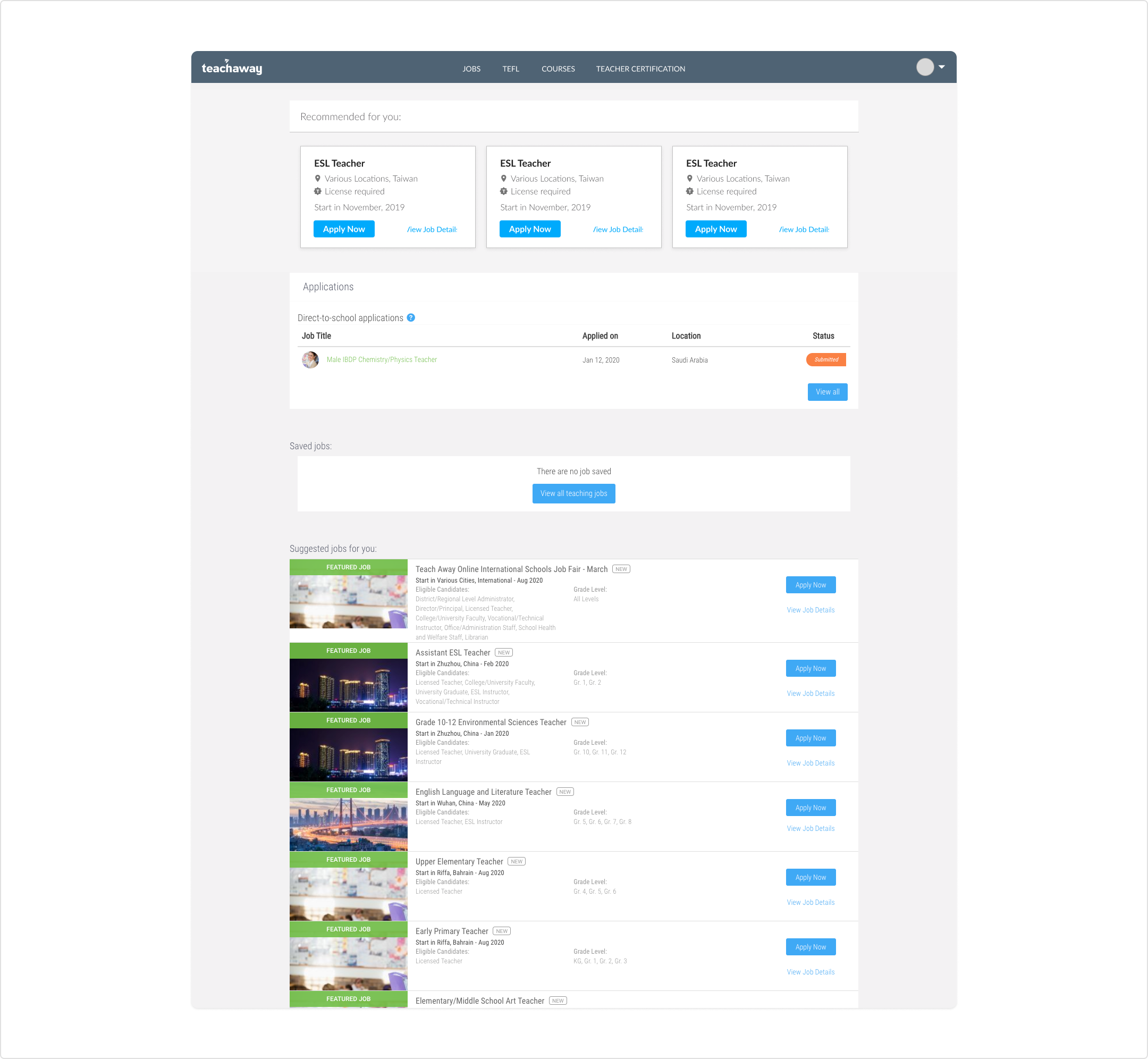
The old dashboard opened with three recommended jobs, then one row of applications, a saved jobs box which is empty if there is nothing saved, and ten featured listings. The things a teacher comes back to check, like where their applications stand, took up the least space.
Built for listings
Ten featured jobs filled most of the page. Applications got a single row and a "Submitted" label.
No reason to return
Nothing changed between visits unless new jobs were posted. No status, no progress, no news.
No home for revenue
Courses and certifications, the products marketing needed to sell, did not appear on the dashboard at all.
What the data said
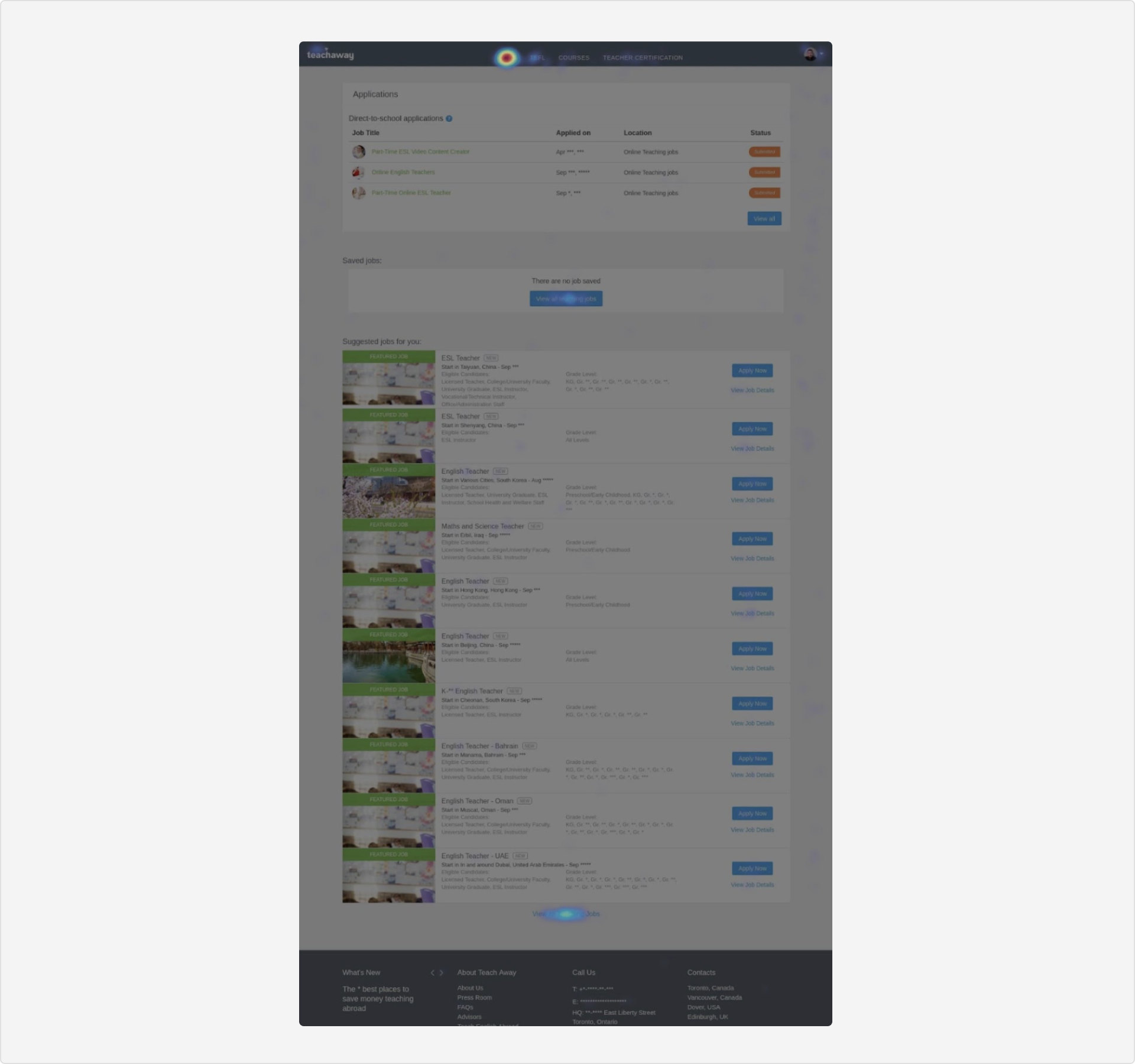
Google Analytics showed where teachers went after the dashboard. Hotjar showed what they clicked while they were on it.
Where teachers went after the dashboard
Share of page views that came from the dashboard, by destination. 21,305 page views, Google Analytics, 2020.
WHAT IT MEANT
The dashboard was a pass-through. Teachers used it to reach the job board, and the actions the business needed, completing a profile and buying a course, barely registered.
03 · REQUIREMENTS
Sixteen asks, one page
With my PM, I set the goals and KPIs first: more engagement, more job applications, and more course and certification sales. Marketing then brought sixteen requests, from targeted ads to a toggle for how schools see a profile.
Adding sixteen widgets would have rebuilt the problem. Each request had to earn its place by answering a question a teacher actually has.
| Stakeholder ask | Design response |
|---|---|
| Show how complete a profile is | Profile Strength card with an Edit profile button |
| An easy way to say you are actively seeking | Employment status dropdown |
| How schools view my profile (toggle) | "Let schools find you" toggle |
| Application status, status bar | Status on every application, and Open or Closed on every job |
| Saved job no longer accepting applications | Closed state with a tooltip that explains why |
| Recent content we have posted | Latest News and Updates card |
| Update location easily | Location shown under the teacher's name |
| Promote training programs | Courses and Certificates module, separate from jobs |
04 · KEY DECISIONS
Three calls that shaped the page
Version 1, then feedback
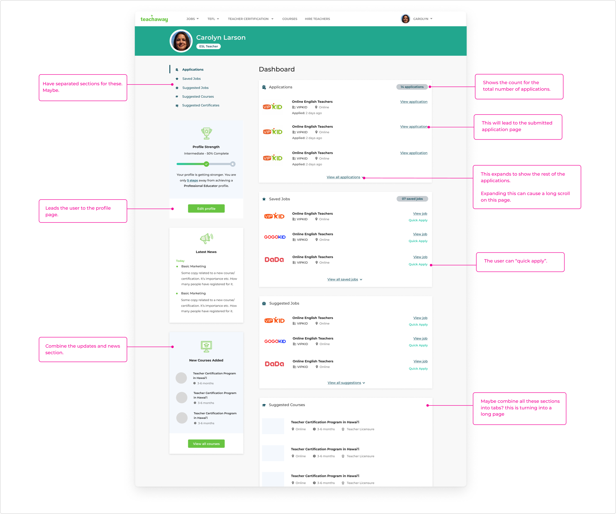
My first version kept every section on one long page, with a side menu to jump between them. I took it through feedback sessions with stakeholders and the PM, and noted the open questions right on the design. The final structure came out of those sessions.
1. Tabs instead of a feed
Recommended, applied, saved, and suggested jobs became one Jobs module with tabs. The page got shorter, and applications moved from a single row to a tab of their own.
2. Status that answers "what happened?"
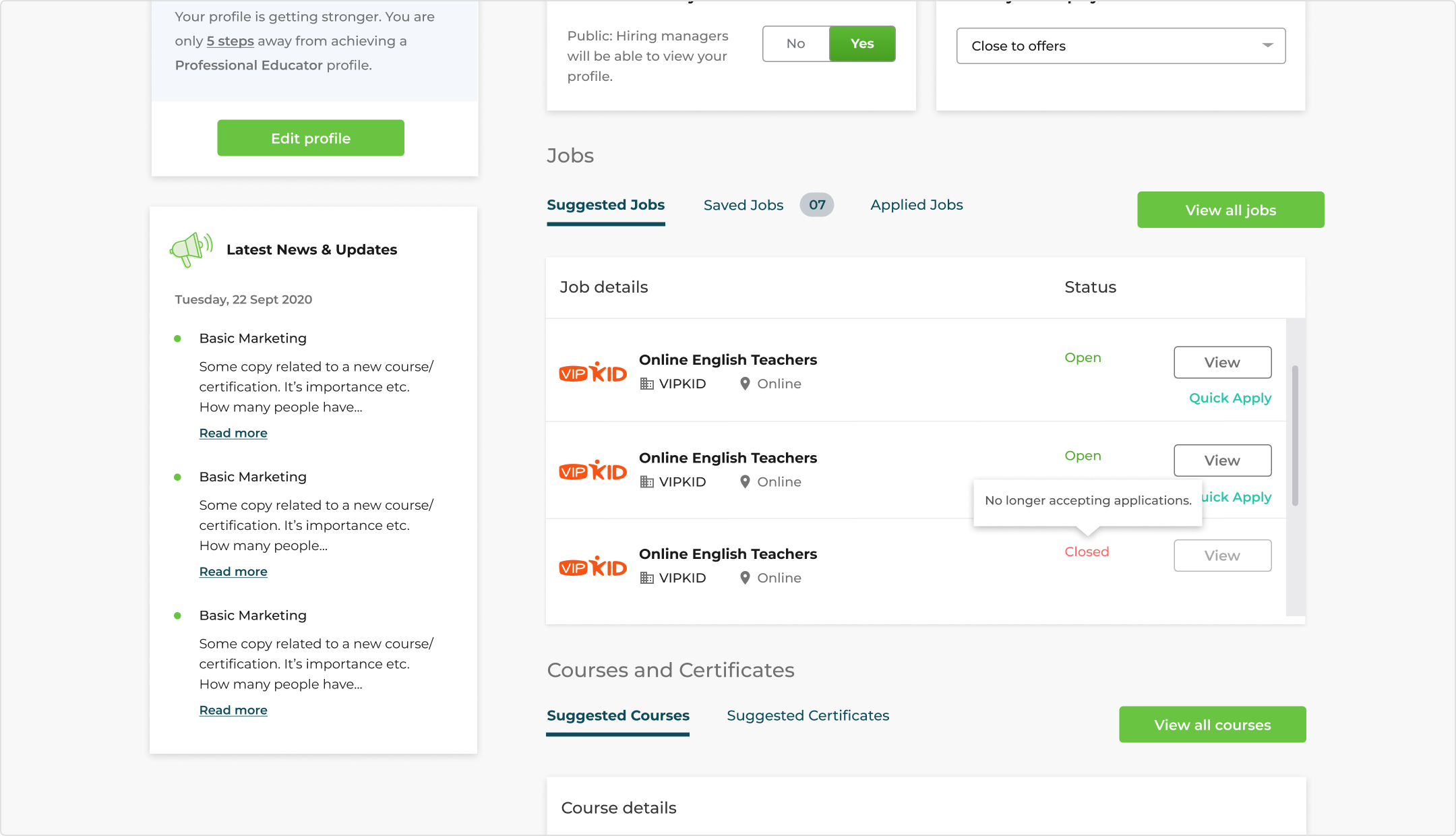
Applications now show where they stand: Submitted, Received, or In review. Saved and suggested jobs show whether they are still open, and closed jobs say why: "No longer accepting applications." It answered open questions from version 1: draft applications, statuses, and how many to show.
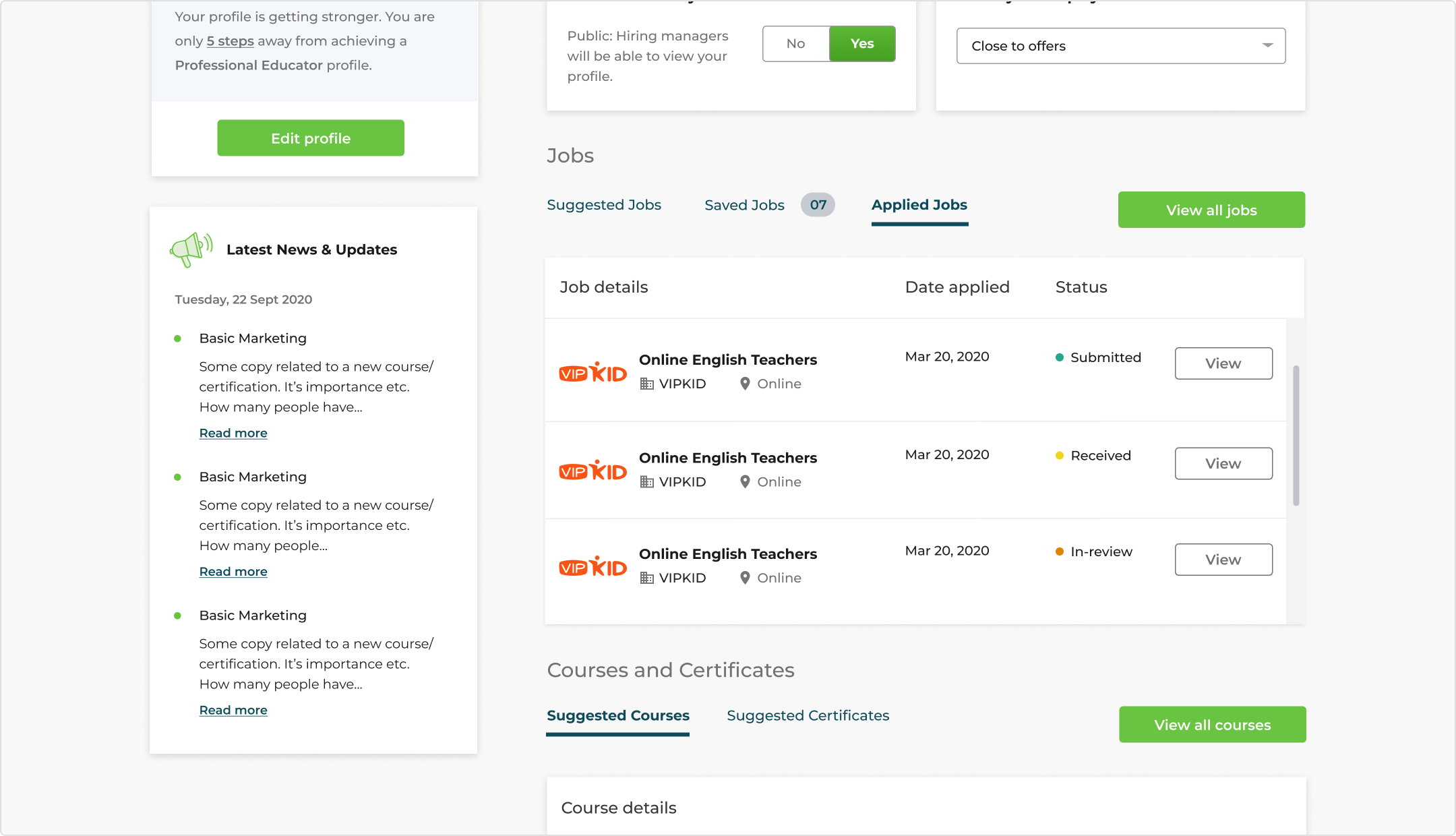
3. A signal for schools, not just teachers
I moved two controls from the sidebar to the top of the dashboard: "Let schools find you" and an employment status. Up top, more teachers would see and use them, and they tell schools which teachers are open to offers. That makes the dashboard work for both sides of the marketplace. Profile Strength sits in the left column and points to the steps that make a profile hireable.
THE TRADE-OFF
Marketing wanted space to promote courses. Teachers wanted their job search. I gave courses their own module below jobs instead of mixing promotions into the job list. Revenue got a permanent place without making the job search harder to use.
05 · FINAL DESIGN
Designed for every state, on web and mobile
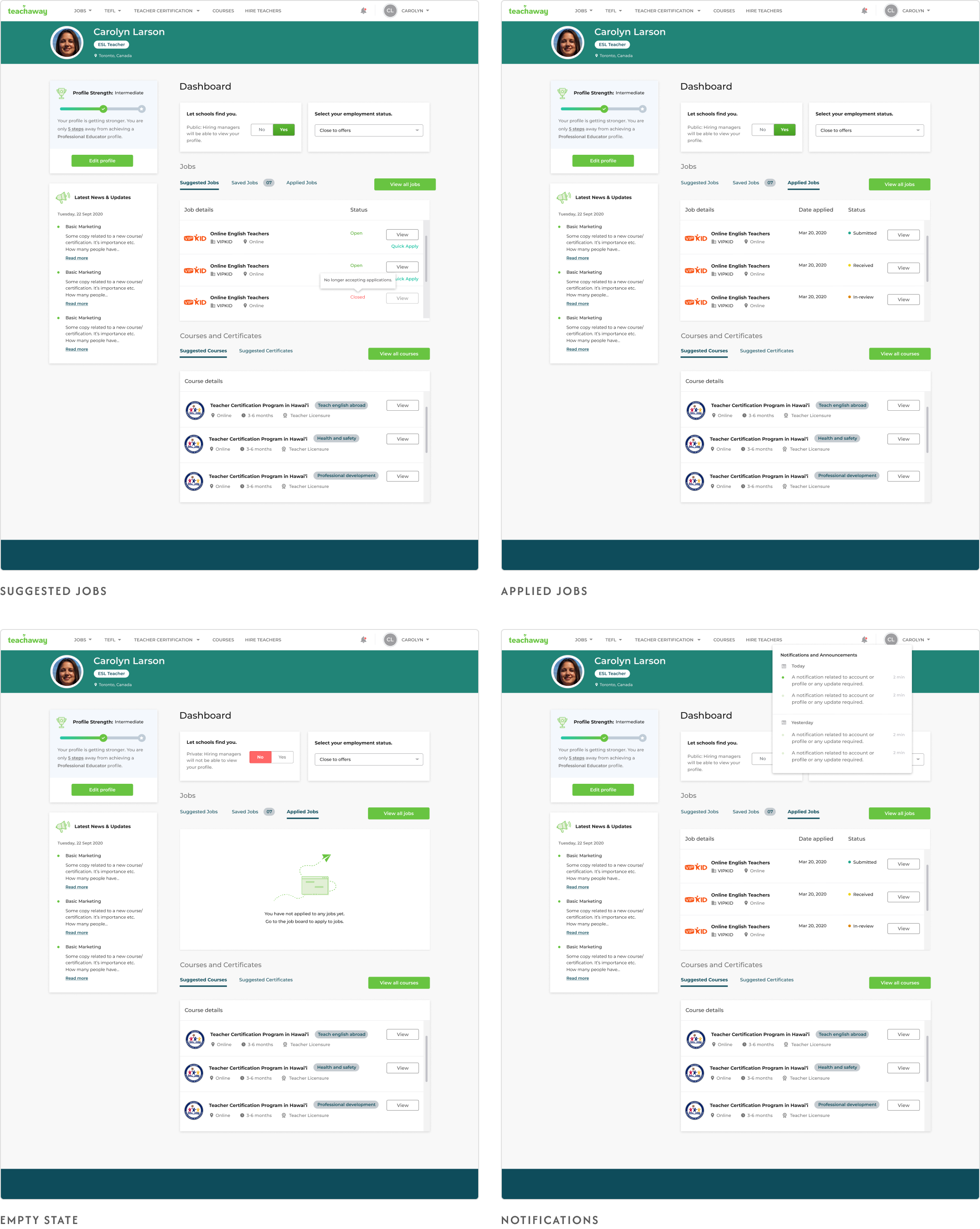
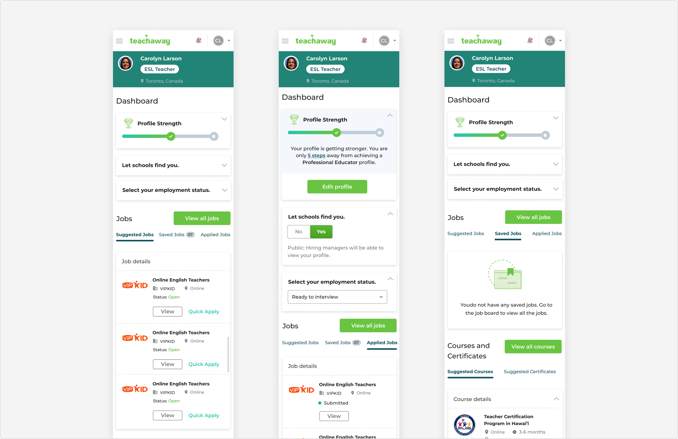
The final set covers suggested, saved, and applied jobs, empty states for new teachers, a notifications panel, and mobile layouts with tabs and collapsible sections.
What changed, and why
Jobs moved into tabs
Separate job cards became one module with Suggested, Saved, and Applied tabs. The page is shorter and teachers scroll less, and the space saved can go to other sections if needed. Schools already use tabs on their dashboard, so both sides of the product share one pattern.
Suggested comes first
Suggested Jobs is the first tab, ahead of Saved and Applied. The default view nudges teachers toward their next application instead of only reviewing past ones.
Status in every row
Applied jobs show Submitted, Received, or In review. Saved and suggested jobs show Open or Closed. A closed job greys out its View button, drops Quick Apply, and a tooltip says why: "No longer accepting applications."
Apply without leaving
Quick Apply sits under View on open jobs, so a teacher can act on a suggestion right from the dashboard. Fewer steps between seeing a job and applying supports the applications KPI.
Visibility and status up top
"Let schools find you" and employment status moved from the sidebar to the top of the dashboard, where more teachers will use them. Options like "Ready to interview" give schools a clear signal. Marketing owned the final copy.
Profile as a goal
Profile Strength shows a progress bar, how many steps are left, and an Edit profile button. Completing a profile becomes a visible goal, not a buried setting.
Courses in their own module
Courses and certificates use the same tab pattern, with format, duration, and licensure type on each row. Promotions stay out of the job list, so the business gets a permanent place to sell without crowding the job search.
A reason to come back
Latest News and Updates gives marketing a dated feed in the sidebar, and a notification bell covers account updates. Empty states tell new teachers what to do next instead of showing a blank box.
Hallway testing
Once the final designs were done, and before we shipped, I ran hallway tests with teachers who work at Teach Away. The feedback was positive: they called the redesign simple and intuitive, and said the suggestions felt relevant to them.
“I love how easy it is now. It also looks good to the eye. When I land here, I know exactly what actions to take.”
Teacher · Hallway test
“I really like the suggested jobs and suggested courses sections. I like how they are relevant to what I want.”
Teacher · Hallway test
06 · OUTCOME
Shipped, and teachers did more on it
The redesign shipped in 2020 and moved all three KPIs we set with the PM before design started. In the three months after launch, courses finally had a place on the page, teachers engaged with it more, and each teacher applied to more jobs.
07 · REFLECTION
What I'd do differently now
Measure the page itself.
Our data showed where teachers went after the dashboard, not what they did on it. Today I'd add tracking to each module before launch, so the redesign could be judged on its own.
Test beyond the building.
Our hallway tests used teachers who work at Teach Away. The feedback was useful, but they knew the product and the company. Next time I'd add a few teachers from outside to check that the redesign holds up for people seeing it fresh.
Name the business goal out loud.
Selling courses was a real goal. Giving it a clear, separate place kept trust with teachers. I'd make that trade-off explicit with stakeholders sooner.
Thanks for reading.